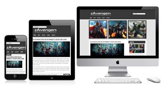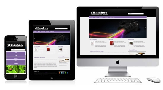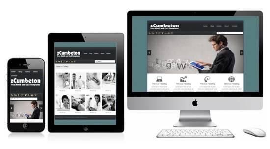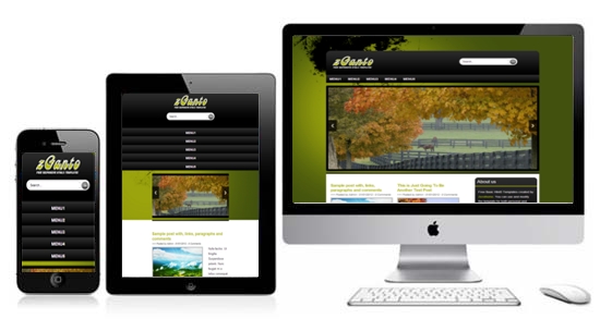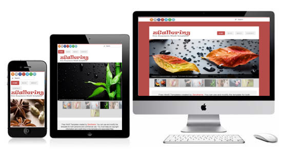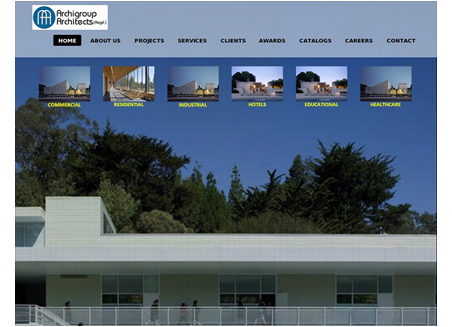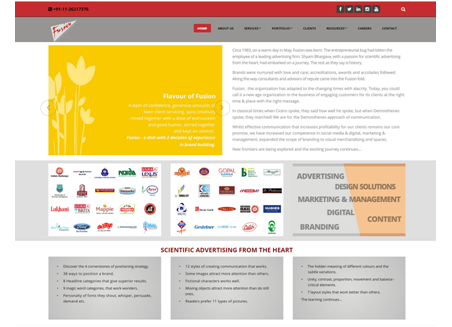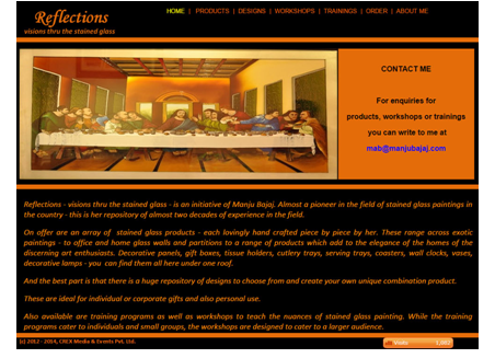



What sort of device you're reading this on? A laptop? Maybe you're at your desk reading the words on a cinema-sized display. Or - perhaps even more likely - you've got a smartphone in your hand and you're thumbing through on your way to another meeting.
Smartphones and tablets have changed the approach toward design and user experience. Before the proliferation of mobile devices with advanced web-browsing capability , web designers had only one primary challenge to deal with - keeping the same look and feel of their websites in various desktop computer browsers.
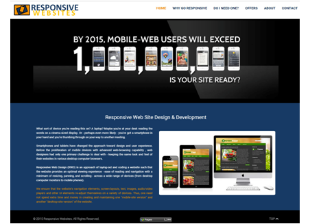
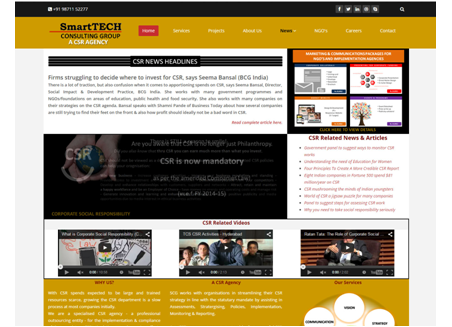
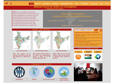
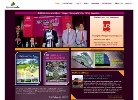
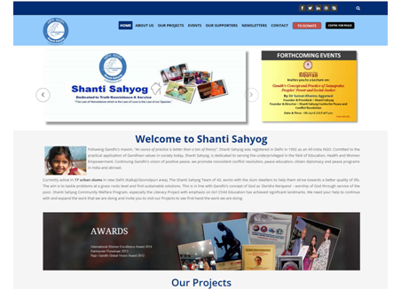
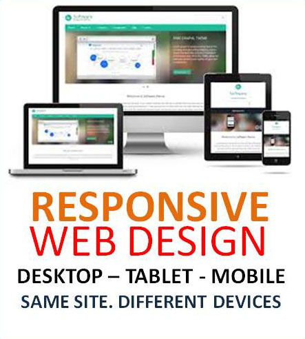
Responsive Web Design (RWD) is an approach of laying-out and coding a website such that the website provides an optimal viewing experience - ease of reading and navigation with a minimum of resizing, panning, and scrolling - across a wide range of devices (from desktop computer monitors to mobile phones).
We ensure that the website's navigation elements, screen-layouts, text, images, audio/video players and other UI elements re-adjust themselves on a variety of devices. Thus, one need not spend extra time and money in creating and maintaining one "mobile-site version" and another "desktop-site version" of the website.
